Consultiq

Consultiq is a complete solution to modern business problems. Consultiq believes in inclusivity and therefore work not as advisor but as part of clients’ teams to help reach their goals in most effective manner.

Brand Story

Consultiq believes that business is more than just a job. It’s an art form. It’s an opportunity to make a difference in the world and to help people grow and change for the better. Consultiq believes building a relationship with clients, listening to them, and helping them identify their goals and build a plan to achieve them. It doesn’t just end there, Consultiq remains with the clients to implemenet the solutions and ensure their effectiveness.

Target Audience

Business Owners and Managers

Nature of Audience

~100,000

Number of Audience
20221019-112517

Brand Colors

Consultiq is a company that strives to make the world a better place by providing the highest-quality products and services. They believe that the future of business is in the hands of their clients, and they work to ensure their clients’ success.
Consultiq’s brand color palette reflects their commitment to their clients: Black represents sophistication, blue represents trust, and Purple represents Leadership.

HEX: 080422
CMYK: 248-79-7

Rich Black

HEX: B55CE6
CMYK: 279-73-63

Medium Orchid

HEX: 4E87F0
CMYK: 219-84-62

Blueberry

HEX: 70DCF4
CMYK: 191-86-70

Crayola

HEX: CCF6FF
CMYK: 191-100,90

Water

HEX: F3E3FF
CMYK: 274-100-95

Lavender

Use of Gradients

Colours used from pallete above

Color 2 and 3

Colours used from pallete above

Color 2 and 3

Icons & Illustrations

We created icons and illustrations that communicate the value of the product, helping users understand what Consultiq does and how it helps them.

Typography

We chose a clean, modern font for Consultiq’s brand story. It’s a simple, yet elegant typeface that lets the content of our stories shine through.
We chose Azo Sans Font Family which gives a professional, bold and consistent look and feel to the brand.

Text Style

Size

Weight

Heading 1

44px

Bold

Heading 2

40px

Medium

Body

18px

Medium

Buttons

18px

Medium

Aa

Sed ut perspiciatis unde omnis iste natus error sit voluptatem accusantium doloremque laudantium, totam rem aperiam, eaque ipsa quae ab illo inventore veritatis et quasi architecto beatae vitae dicta sunt explicabo.
0123456789

Design Concepts

The process of creating a logo can be really fun and exciting, especially when you’re working with a client who is as excited as we are about the prospect of seeing their new branding come to life.
Concept 1
The First concept was a duo-tone signature style logotype. Using a custom typography and a line to signify growth. However, it did not go quite with the brand of Consultiq after a thorough review.
Logo_mockup
91356 1
Concept 2
This concept was really appealing to Consultq as it depicts diversity and how Consultiq can help each client grow. The vibe of this design was very relevant.
Approved Concept
This Final concept was the show-stopper for us and also for Consultiq Team

LOGO ICON

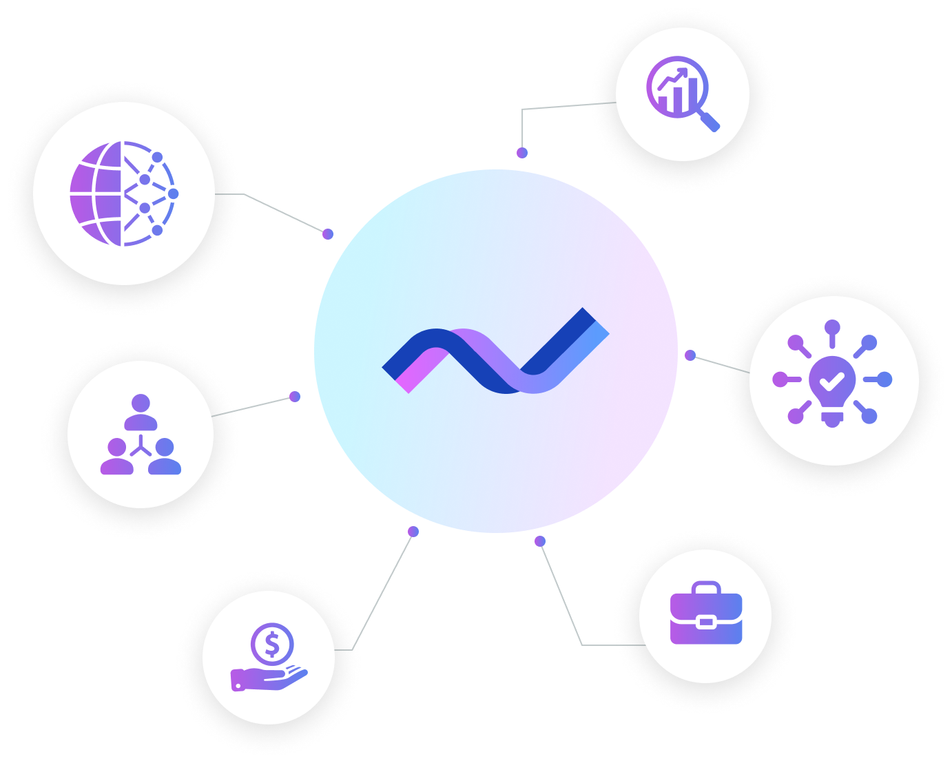
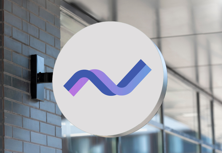
A seamless twining of two lines. The solid blue represents Consultiq and gradient line represents different clients. The concept was driving on the ideology that Consultiq works with the clients and takes over their problems as Consutiq’s own. Also it represents collective growth of Consultiq with their clients.

LOGO TEXT

Solid letters to depict boldness of the brand and give out a professional vibe. We kept is clean and simple to go with the brand personality.
5800894-3
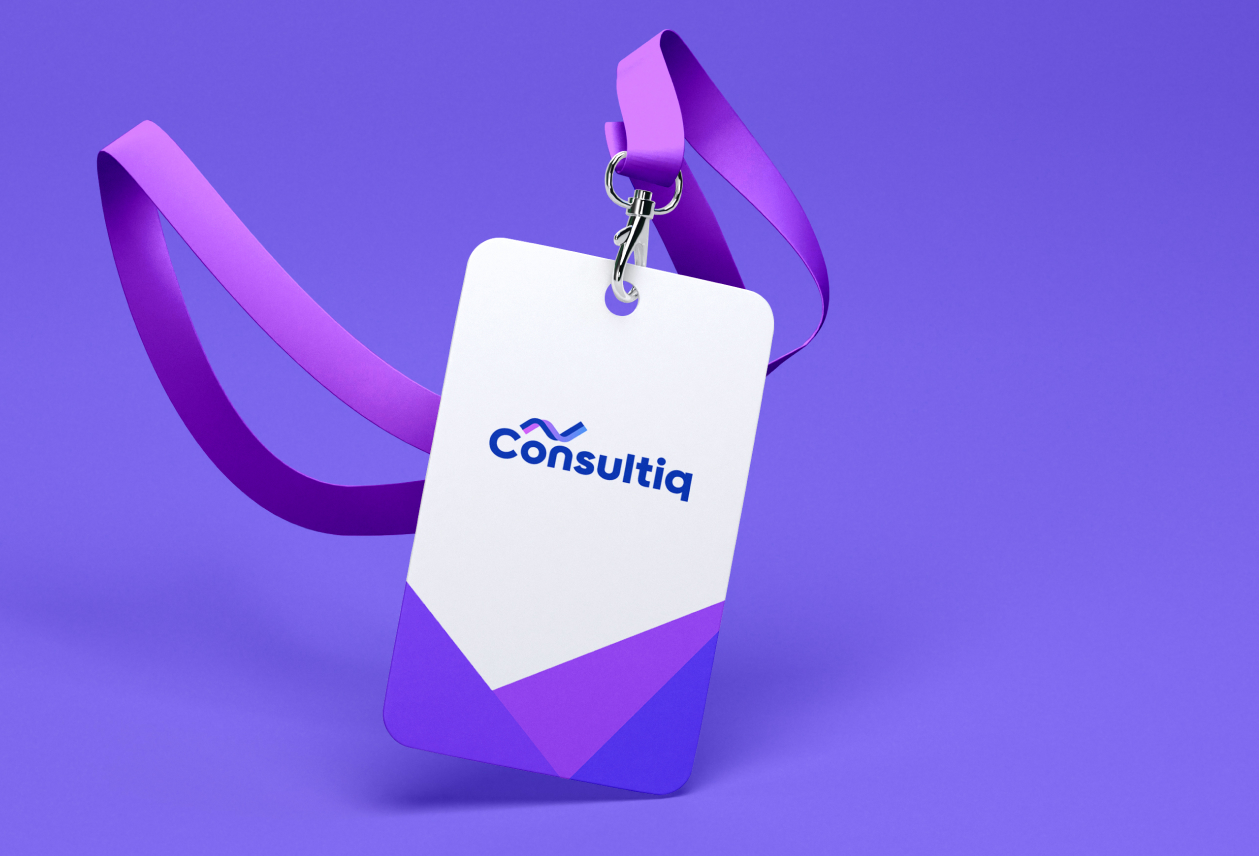
White_T_Shirt_Model_Front
20_April_08 1

Our Design Process

We started by getting to know about Consultiq and its goals, needs, and mission. We asked questions to make sure everything is on the table and nothing is overlooked. After a thorough research, our UX Team worked on creating the most user-friendly webflow. Our UI experts then filled the magic into those wireframes to hand-over to our programmers.

Discovery
2 DAYS

research
4 DAYS

sketches
3 DAYS

wireframes
7 DAYS

branding
4 DAYS

Aesthetics
8 DAYS

development
20 DAYS

Discovery
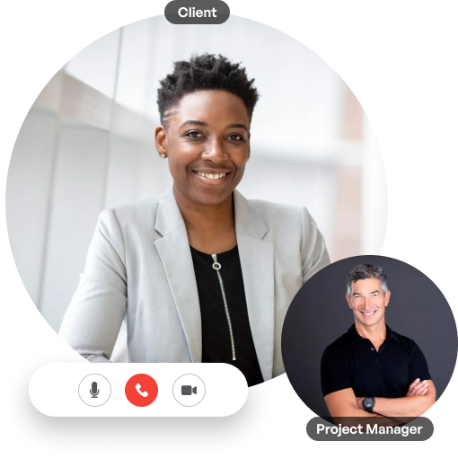
We believe in the power of discovery calls and meetings. They’re a chance to get to know your client, and they’re also an opportunity for you to learn how they work, what their goals are, and what challenges they’re facing.
We talked with Consultiq about their needs, challenges, and goals. By end of the sessions we were confident about the information we had on our hands.
Group 1000002185

Research

We did extensive research through creating personas of the target clients of Consultiq, doing extensive surveys and analyzing the outcomes. We gave some valuable insights to Consultiq regarding their process and functions which they received with delight.
person_01

Pain Points:

Sed ut perspiciatis unde omnis iste natus error sit voluptatem accusantium doloremque laudantium, totam rem aperiam, Sed ut perspiciatis unde omnis iste natus error sit voluptatem accusantium doloremque laudantium, totam rem aperiam, Sed ut perspiciatis unde omnis iste natus error sit voluptatem accusantium doloremque laudantium, totam rem aperiam,

person_02

Pain Points:

Sed ut perspiciatis unde omnis iste natus error sit voluptatem accusantium doloremque laudantium, totam rem aperiam, Sed ut perspiciatis unde omnis iste natus error sit voluptatem accusantium doloremque laudantium, totam rem aperiam, Sed ut perspiciatis unde omnis iste natus error sit voluptatem accusantium doloremque laudantium, totam rem aperiam,

What We Do
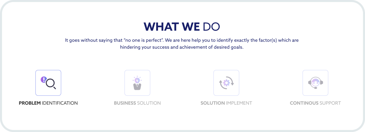
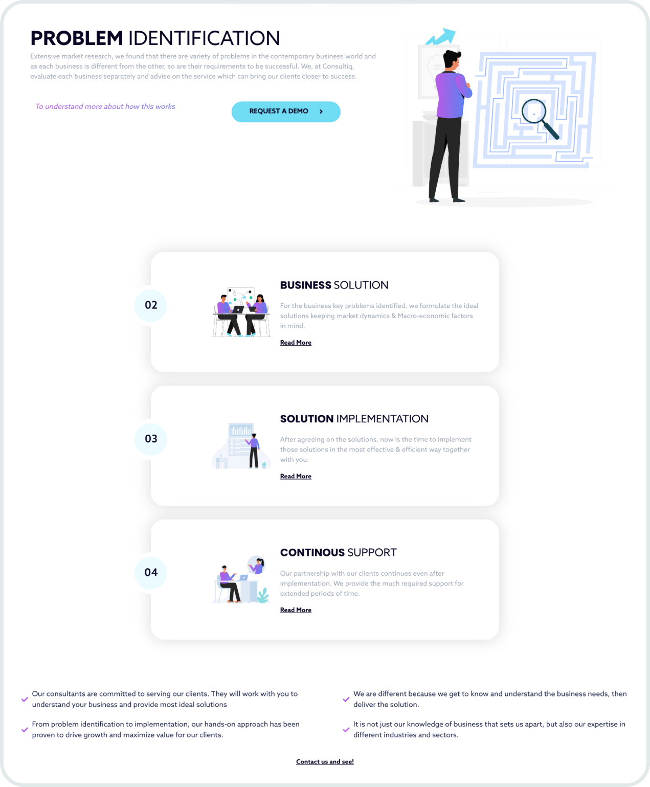
What We Do is basically a series of processes that Consultiq deploys though any typical consutlancy project they have. We gave them a bit of re-touch and displayed them in a way that any website visitor will easily understand.
Group 1000002155
image 66
image-67

Functions

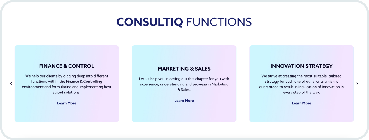
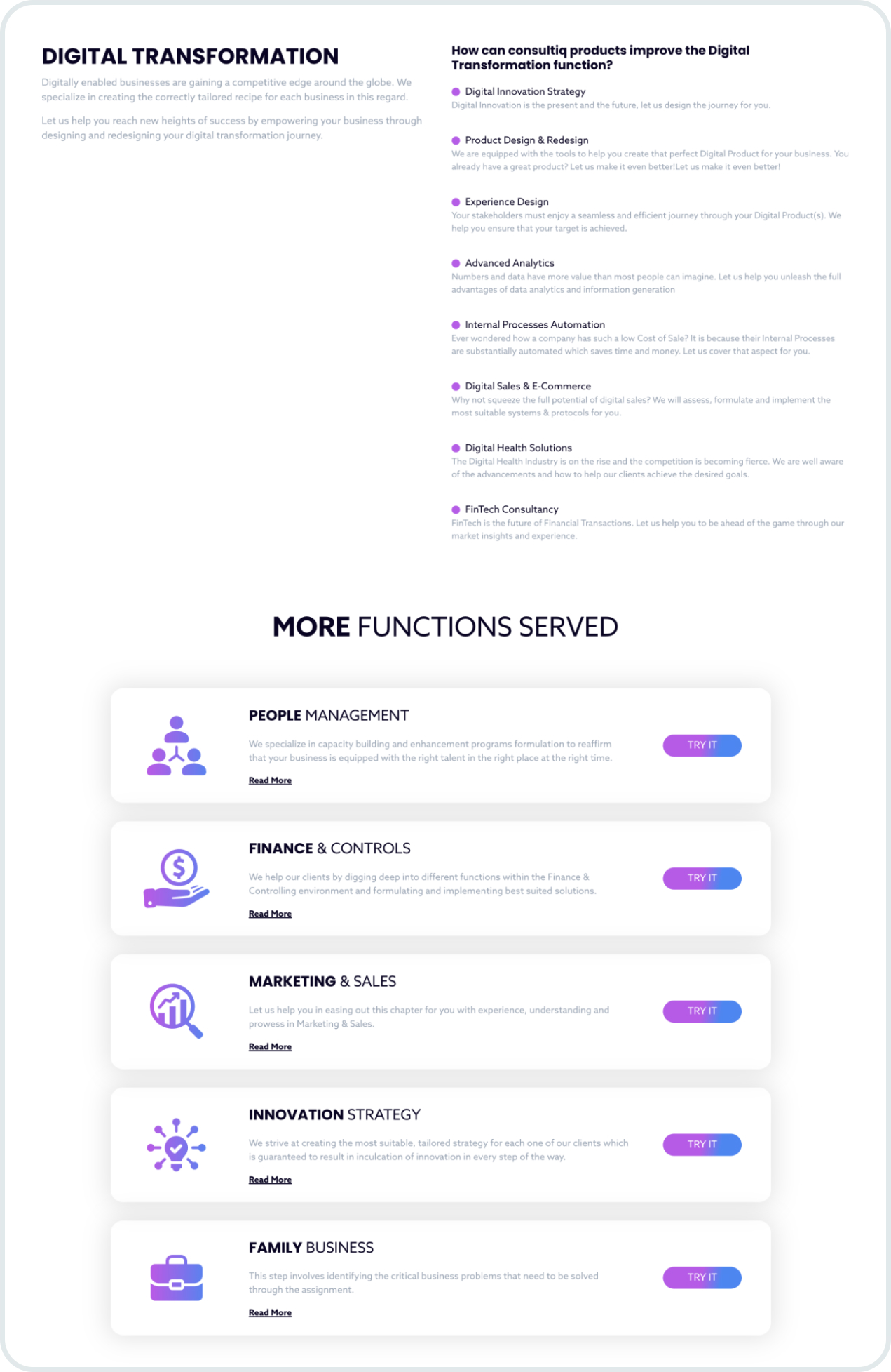
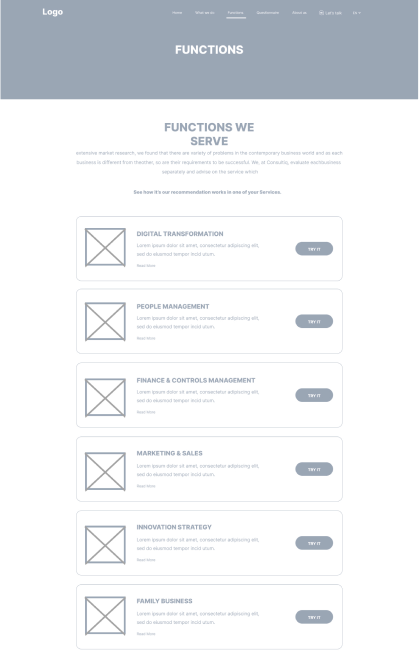
Consultiq provides business consultation to their clients which revolves around 6 functions. We made sure that the clients understand them hassle with maximum convinience.
This was a very crucial part of the website as this is a display of their expertise. We put a lot of thought and came up with amazing ideas as to how we can present them so they are well understood.
Group 1000002191 (1)
image 67 (1)
screencapture-consultiq-co-functions-digital-transformation-2022-10-10-15_46_51 1 (1)

Sketches

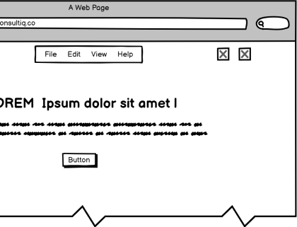
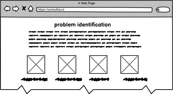
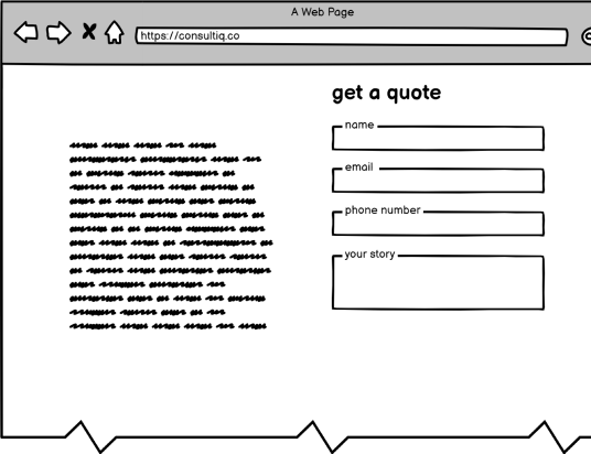
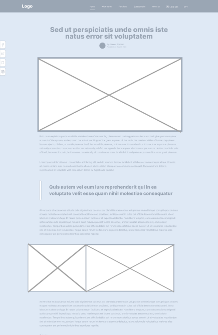
Next step was to create sketches of the wireframes (low-fidelity) which give a basic understanding of how different pages will look like. This is a very crucial part of the design process as the User Experience is based on this.
img_v2_cdce555e-0bb1-469d-8c82-0932fdba346h 1
img_v2_37f69191-3d05-4244-adb6-7b58eeabed5h 1
img_v2_2ffd248e-26a7-49a3-80dd-cac68e1df2eh 1

Wireframes

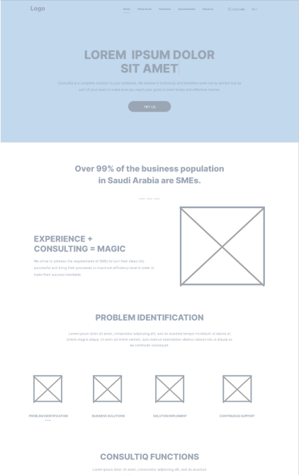
Our UX Experts then converted the sketches into Mid-Fidelity wireframes to help our UI Team to design them according to the branding guidelines set in the Brand Identity phase.
w 1 1
w2 1
w3 1

Branding & Components

Very simple and neat components were used throughout the website which are nice-looking and simple to understand for the users.
20221010-115758

Let’s Transform Together

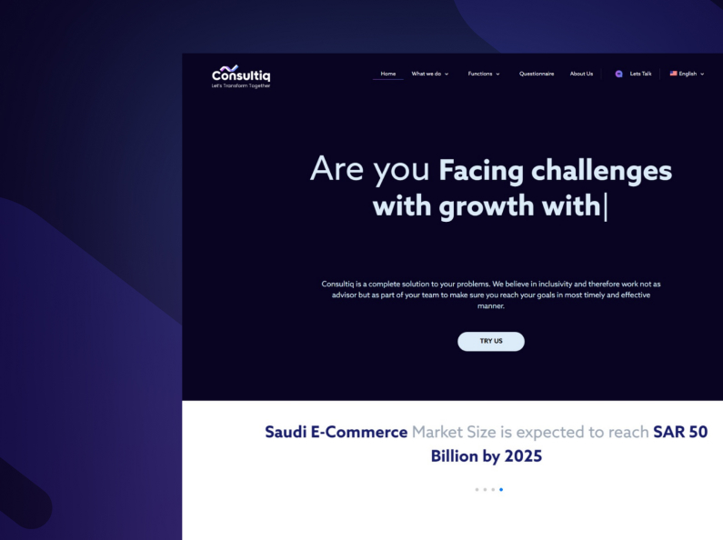
Finally the slogan of Consultiq started coming to life when their wireframes were “Transformed” into High-Fidelity Prototypes. Our client was very satisfied with how their website would look and feel like. We were good to go after minor tweaks.

Simple Typewrite Effect

We used the typewrite effect at the very face of the landing page so that any visitor understands everything about Consultiq within seconds!

Clean & Simple Design

We kept the overall look and feel of the website simple and clean with lots of white spaces. The idea was for the user to identify their required information easily without much of a hassle.
tn 1

The design approach we selected was to ensure their clients don’t miss out anything that would mean something valuable to them.

Moving Road map

Consultiq Team wanted to add a Questionnaire for potential visitors. This questionnaire would help them evaluate their current business situation and acquire Consultiq’s services to help them.

We set up a moving roadmap—a list of questions that were arranged section-wise which don't look boring and encourage visitor to go till the end where we have places a CTA to capture the motivated visitor as a lead.

Our periodic Financial Budgets are quite accurate and our actual Financial Performance rarely deviates substantially.

Our business lines are achieving the desired sales targets which we set in our overall strategy.

Animated Illustrations

To add a some excitement to the website, we added custom animations to some of the objects. They bring life to the website and keep the attention of visitors in place while they navigate through the website and end-up signing up for the services offered by Consultiq.

Development

Design assets were being transferred from our UX/UI Teams to the Development Team as soon as the designs were being approved. Our Senior Developers were very prompt at bringing the designs to life.

Frameworks Used

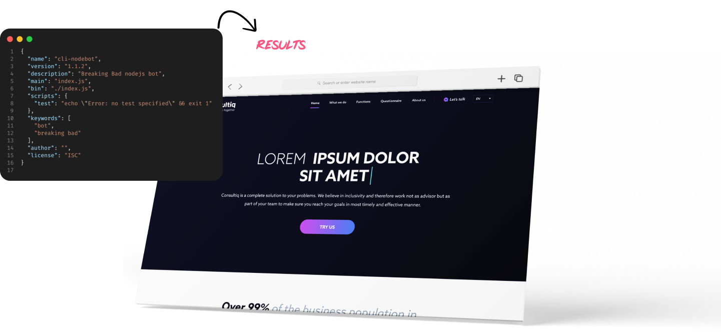
We used a combination of WordPress through Elementor and HTML to do the coding and development for this website.

Why we used them

Development Process

Agile Methodology

Agile is a software development approach that focuses on working in short, incremental cycles called sprints. It’s a management philosophy that emphasizes collaboration and flexibility over planning and predictability.
Why did we choose this approach?
-Maintaining focus and reducing scope creep
-Being able to respond quickly to change
-Allowing developers to work in parallel instead of waiting for each other before they can move on to the next phase
Group 1000002185

Made with by Loopiq

Let’s build something-desktop
Let’s build something-mobile

Let’s build something great together

We thrive on helping you

Get In Touch

Project Budget (SAR)